Create an animated landing page layout with Wow.js
By Andrea Marchetti
@marchetti_design
Today we create an awesome landing page with Wow.js. Wow it’s a javascript plug-in that allows you to create a fancy animations in a web page.

There are many effects available, Fade, Bounce […] implemented using animate.css
How it Works
Applying the class “wow” plus the animation class ( for example “fadeInLeft”) to a element, you set the animation.
<div class="wow fadeInLeft"> […] </div>
The animation starts when the element enter in the viewport.
Installation
Link the javascript file:
<script src="js/wow.min.js"></script>
Link animate.css file:
<link rel="stylesheet" href="css/animate.css"/>
Html
Set up a basic html with the wow classes:
<div class="cop">
<div class="call-to wow bounceInUp">[…]
</div>
</div><div class="panel" id="panel-1">
<div class="box-left wow fadeInLeft">[…]
</div>
<div class="box-left wow fadeInLeft">[…]
</div>
</div><div class="panel" id="panel-2">
[…]
</div>
Note: this code sets a Bounce animation (on call-to elements), a Fade animation (on the box left elements).
For all the effects available visit:
http://mynameismatthieu.com/WOW/docs.html
Experiment and make tests is the right way to create a cool effect.
Css
Add the style required:
.cop{float:left; width:100%; height:100%;display: block; background: #eee;position: relative}
.cop p{width:40%; padding-left:40px;line-height: 24px;color:#666}.panel{float:left; width:100%; height:auto;display: block; background: #333;position: relative;margin:0;padding:0;}
.call-to{position: absolute; width:400px; height:500px; bottom:0;right:100px; background:#26c6da}
.call-to h2{color:#fff; text-align: center; font-weight: 300; font-size: 50px}#panel-1{background: #72d572}
.box-left{background: #5677fc; width:30%;position: relative;left:10%;margin: 40px 0 40px 0;}
#panel-2{padding-top:100px;background: #eee;}
.box-center{background: #f06292; width:70%;position: relative;left:15%;}
#panel-3{background: #fff;padding-top:300px;}
.box-end-right{background: #ffc107; width:400px;right: 0; position: absolute}
.box-end-left{background: #ffc107; width:400px;left:0; position: absolute}
.end{text-align: center; font-size: 50px}
Javascript
Initialize the plug-in:
<script>var wow = new WOW({
offset:100, // distance to the element when triggering the animation (default is 0)
mobile:false // trigger animations on mobile devices (default is true)
});
wow.init();</script>
Responsive

To make the structure responsive we add two media queries, one for tablet:
@media (max-width: 1023px) {.call-to{width:300px; height:340px;}
.box-end-right{width:300px;}
.box-end-left{width:300px;}
.end{font-size: 30px}}
and one for smartphone:
@media (max-width: 767px) {
.cop{height:auto}
.cop p{width:70%;}.call-to{display:none}
.box-left{width:70%;}
#panel-3{padding-top:0px;}
.box-end-right{width:300px;position: relative;width:100%}
.box-end-left{width:300px;position: relative;width:100%}}
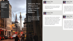
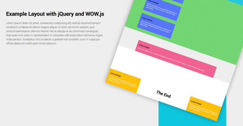
The result is an awesome responsive structure, check the demo below and download the code.
Stay Tuned!
Potrebbero interessarti: